Mobile App Redesign · 2025
Spitogatos
App Redesign
Real Estate Platform for Buyers, Renters, & Property Owners
When Mobile Lags Behind the Web
Spitogatos is the undeniable leader in Greek real estate. But while their web platform offers a powerful, feature-rich search, attempting to use their mobile app revealed a clear problem: an outdated design creating high friction for mobile hunters.
High Interaction Cost
Basic tasks, like applying a filter, required navigating through 2 pages and 5 clicks. The architecture was punishingly deep and convoluted.
Missing Ecosystem Tools
Crucial web features like detailed neighborhood maps, direct messaging tracking, and curated lists were entirely absent on mobile.
Fragmented Attention
Listings and maps competed for the same screen space, creating accidental interactions, visual clutter, and overwhelming cognitive load.
The Mandate: To validate my assumptions, I conducted a deep UX audit analyzing App Store feedback and interviewing actual home hunters. The directive became clear: don't just change the colors. Modernize the architecture, reduce the click-depth, and bring the mobile app up to par with the website.
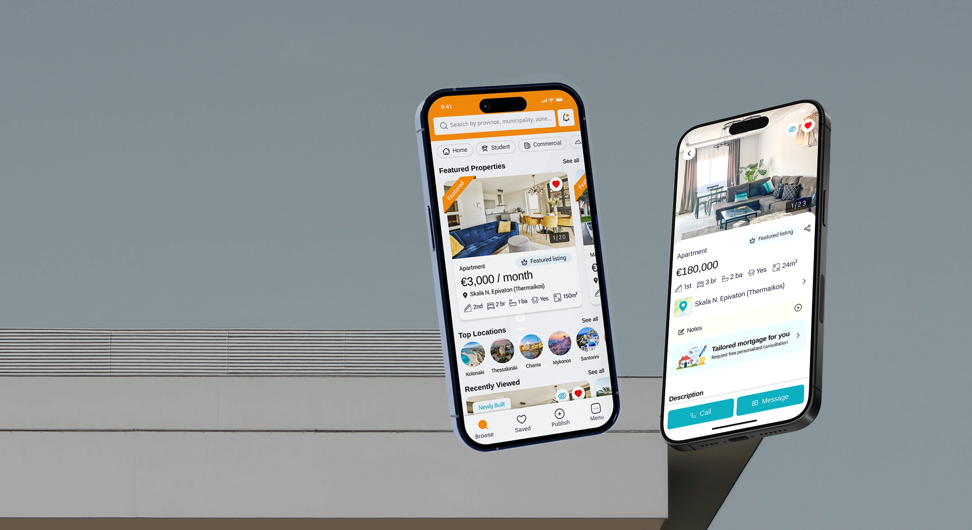
A Blueprint for Frictionless Discovery
Redesigning a market leader is an exercise in restraint. The goal wasn't to alienate existing users with a radically new mental model, but to optimize the paths they were already trying to take.
Discovery-Led Home
Replaced static menus with an immediate search bar and featured property feeds to reduce bounce rates.
Reduced Clicks
Eliminated 5-step flows in favor of direct-manipulation sliders and inline dropdowns.
Centralized Hubs
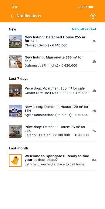
Introduced a "Notifications" page to track listings and receive updates—a major missing feature.
Scannable Listings
Rebuilt the property pages using icon-driven architecture and advanced local maps to provide context.
Rethinking the Core Experience
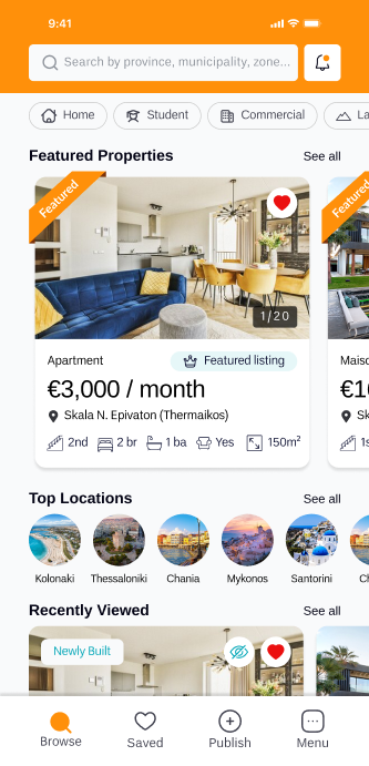
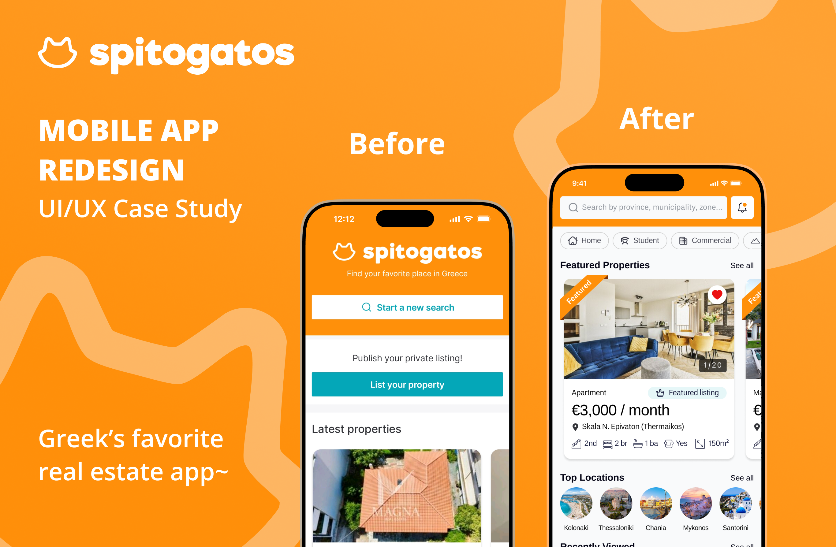
From Static Home to Active Discovery
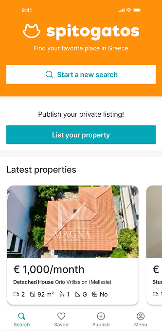
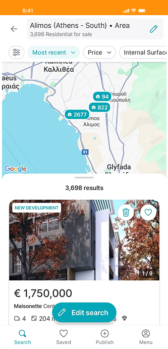
- The Old Way: First-time users were greeted with "make a decision: list or search" that divided attention. Only 1 section suggesting "Lastest properties" and no vertical scroll, hindering discoverability.
- New Search Bar: A show don't tell strategy, an element that users are familiar with, inviting them to search not telling them to.
- Web Parity: Brought "Featured Properties" and "Top Locations" directly to the mobile home feed, guiding exploration for users unfamiliar with regions.
- Vertical Scroll: Shifted to a standard vertical feed to improve discoverability and reduce immediate bounce rates.
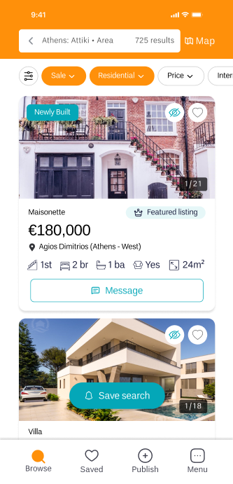
Resolving Interaction Conflicts
- Context Switching: The old design crammed the map and listings into the same view, splitting attention. I separated them into full-screen modes with a clean toggle button.
- Focused Environment: By separating map and listings into full-screen pages, we improve the search process displaying more results per screen which is easier to scan, and reduce visual clutter and accidental interactions (like scrolling the list but panning the map).
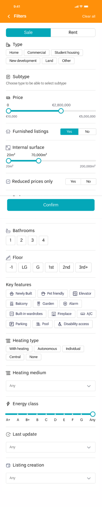
Reducing Interaction Friction
The Challenge: Requiring 4-5 distinct clicks to set a single filter created unnecessary friction, making it cumbersome for users to configure multiple filters efficiently.
- Faster & Intuitive: Reduced number of clicks for each action, lowering cognitive load.
- Unified Space: All filters can now be configured directly within the same page.
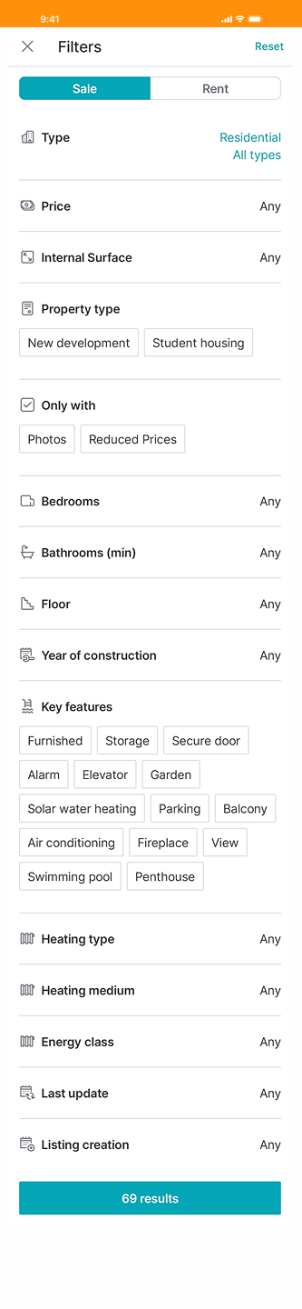
Scannable Information Architecture
Property listings are famously long and dense. The old layout hid vital features and relied on walls of text. By utilizing icon-driven grids and bringing web features to mobile, we answer the unspoken question: "What's it like to live here?"
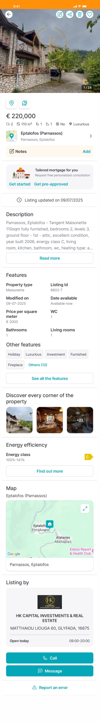
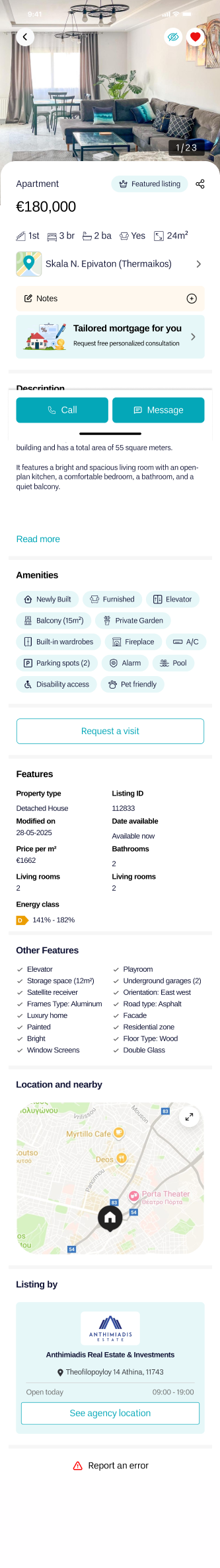
- De-duplication: Cleaned up duplicate CTA buttons that were hogging primary screen real estate at the top of the page.
- Visual Hierarchy: Replaced heavy descriptions with an icon-driven grid for amenities, making crucial details scannable in under 3 seconds.
- Neighborhood Context: Added an advanced map integration displaying nearby transit, supermarkets, and gyms directly within the listing view.
The Notifications Hub
The current app lacked a dedicated notifications page and relied solely on email alerts. Bringing this native to mobile was a necessary step for retention.
- Keep Users Updated: Delivered alerts directly in the app, eliminating the need to leave the platform.
- Centralize Alerts: A single hub for easy access and review of all property updates.
- Custom Preferences: Empowered users with custom settings for a more personalized push experience.
- Brand Personality: Reinforced the Spitogatos connection through welcome messages and frequent, friendly updates.
Strategic Reflection
I took this on as a passion project—part challenge, part obsession—to rethink a real product and explore how it could better serve its actual users.
Redesigning the Spitogatos app was ultimately an exercise in bridging the gap between web capabilities and mobile constraints. The biggest lesson from this deep dive was understanding that modernizing UI isn't just about updating colors or typography. It's about interaction economics.
By actively listening to real user pain points, removing duplicate CTAs, transitioning 4-click filter flows into 1-page architecture, and bringing proactive features like notifications native to the app, the result is a cleaner interface with a significantly more intuitive user experience.
Complete Design Presentation
Explore the full UI kit, color typography breakdowns, graphic assets, and all redesigned screens in high-res detail.
The Thinking Behind the Pixels
A deep dive into the UX audit, user interviews, competitor analysis, and the strategic design decisions that shaped this redesign.